MS Paint Adventures uses a variety of fonts - each font is used in certain contexts and communicates a different "feel". Many of these fonts are actual predefined computer generated fonts, while others are handwritten by Andrew Hussie.
Several sections are dedicated to listing the handwritings employed by different characters throughout Homestuck.
Computer Generated Fonts[]
Courier New[]
The Strife commands seen in Homestuck.
The main font used for texts and commands used to be Courier New (Bold). It is a basic and widely used font aiming for readability.
Most action commands and sound effects are rendered using this font, in 14px, with no Anti-Aliasing, then resized to 400%. An example would be the battle commands during a Strife.
This is also the font in which Dad types his typical heartfelt notes, but in a different size, with aliasing.
The font is often mistaken for Courier, although it is slightly different. Text has been sometimes displayed in Courier as well as in Courier New - Sassacre's Daunting Text is written in basic Courier.
Verdana[]
This is the font used on the text that you click to go to the next page of the comic. This text is always underlined and is generally in the color #1b00ee and after hitting it the text changes to #551A8B.
This font is also used in alchemy panels to display item names and grist count.
Comic Sans[]
Primarily used in SBaHJ and quotes from SBaHJ in Homestuck. This font is considered tacky and overused by some people.
Lucida Console[]
Used on GameFAQs guides, such as Rose's walkthrough.
Apart from that, Lucida Console Semi-Condensed is the font used on sylladex and strife specibus cards.
Rapscallion[]
Used in the Midnight Crew and Felt-related flashes such as Midnight Crew: Act 1031![]() , this gothic font is meant to invoke the film-noir, twenties-odd atmosphere these mobsters revel in. It is downloadable here.
, this gothic font is meant to invoke the film-noir, twenties-odd atmosphere these mobsters revel in. It is downloadable here.
Carima[]

The font used in the introductions of the kid’s lands as well as Prospit and Derse (excluding the troll's Prospit and Derse). Fairylike, it’s probably meant to portray the magic journey the player is starting on.
It is used for both Jane's and Andrew's DEAD panels and is available here. It is also used in Calliope and Caliborn's chess match.
The King and Queen font[]
Presumably the same as their handwriting, the White Queen of Prospit and Black Queen of Derse communicate using this font with their designated children in their roles as Exiles.
An elegant and regal-looking font, it is obvious why Andrew chose it for this purpose. It is available for download here.
An All Star[]
The troll language, instead of using the Roman symbols humankind developed, instead employs certain rune-like characters, each matching a letter in our own alphabet. Used for almost everything troll related. Exceptions amongst other things are Vriska's handwriting and the troll's planet names.
In actuality, this font is an upside down, mirrored version of an existing font.
This already flipped-around font can be downloaded here, which hosts three versions of the font made by two different fans.
Grimoire Fonts[]
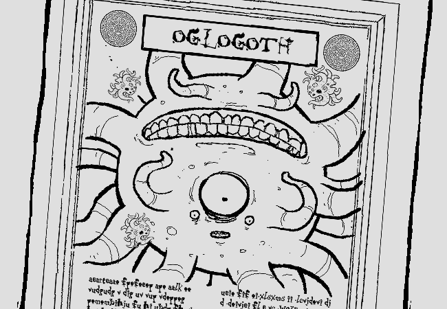
OGLOGOTH, THE DEEP ONE
- The front cover of Rose's Grimoire for Summoning the Zoologically Dubious is Nueva Standard.
- The text in Rose’s Grimoire for Summoning the Zoologically Dubious is written entirely using Mister Twiggy.
It is also the font by which the Horrorterrors apparently communicate with their protégées, as seen when Rose asks the magic cueball for information about the Horrorterrors’ true alignment.
Daunting Text Fonts[]
- Fontdinerdotcom Sparkly is used on the front cover of Colonel Sassacre's Daunting Text of Magical Frivolity and Practical Japery. It can be found here.
- The frontispiece's text appears to be a horizontally compressed version of Times New Roman.
- The main body of the work is Courier New.
Batman Forever Alternate[]
The font used in [S] Dirk: Synchronize![]() is Batman Forever Alternate.
is Batman Forever Alternate.
Maverick[]
Used on the front cover of The Fatherly Gent's Shaving Almanac. Can be obtained here.
Berlin Sans Fb[]
Used for the descriptions on the Troll Call cards.
MoTenacity AOE[]
The font used for Sburb's logo. One can find it here.
GameBro Fonts[]

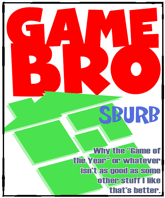
- GhostKid AOE is GameBro Magazine's title font. Buyable here.
- Also used for the flavors of the Fruit Gushers, as seen during John's mental breakdown.
- Siesta N4 - utilised in GameBro's front page feature text. Found here.
Pony Pals Fonts[]
- The "Pony Detective" font on the front cover is Hobo.
- The interior text is Times New Roman.
Newspaper Fonts[]
- The Common Hornographer utilises a modified form of English Towne Normal.
- The body of the Hornographer's text is Times New Roman.
- The METEORS!!! snippet uses Arial Bold.
Hobbiton Brush hand[]
The font used on the front of the box of Special Stardust in Calliope's room. Attainable here.
Dream Bubbles Fonts[]
The title and author name on the cover of Charles Dutton's Dream Bubbles![]() are written using another vastly overused font, namely Papyrus. Graphical designers strongly dislike the bad kerning (spacing) of the letters in this font type.
are written using another vastly overused font, namely Papyrus. Graphical designers strongly dislike the bad kerning (spacing) of the letters in this font type.
Bone Regular[]
The font used for Kurloz's text. You can find it here.
Strife! cover art[]
The font used for the title on the cover art for the Strife! music album is Bank Gothic BT. It is reused at the start of Rose's strife against Jack![]() . Later, at the start of Vriska's battle against Jack
. Later, at the start of Vriska's battle against Jack![]() , the word "GRIEF" is displayed in Alternian characters, which are rendered to resemble the earlier used font.
, the word "GRIEF" is displayed in Alternian characters, which are rendered to resemble the earlier used font.
Black Chancery[]
The font used for the cover of Complacency of the Learned. Can be found here.
Holy Empire[]
Used on the cover of Genesis Frog. Can be found here.
Into the Blue Regular[]
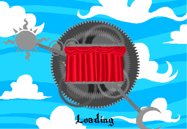
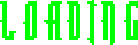
Preloader message for DD: Ascend more casually.
In [S] Jack: Ascend![]() , Andrew appears to have changed from his traditional font for flash preloaders. The loading screen for the flash detailing Jack’s ascension has the "Loading" text displayed in an orange font. This font is also seen in the preloader of [S] Jade: Wake up
, Andrew appears to have changed from his traditional font for flash preloaders. The loading screen for the flash detailing Jack’s ascension has the "Loading" text displayed in an orange font. This font is also seen in the preloader of [S] Jade: Wake up![]() , as well as in the other dream flashes.
, as well as in the other dream flashes.
It is also seen in [S] DD: Ascend more casually![]() , furthering the parallels between the two ascensions.
Though still readable, this font might be meant to invoke a sense of alienation, as well as remind the reader of a certain indestructible demon.
, furthering the parallels between the two ascensions.
Though still readable, this font might be meant to invoke a sense of alienation, as well as remind the reader of a certain indestructible demon.
A similar font is seen in [S] Jade: Pester John.![]() , but in blue.
, but in blue.
It can be found here.
Dictator font[]

On Dave's Bro's computer![]() , the login screen displays the message seen to the left. The font resembles a bit the one used in the captions in And It Don't Stop, a comic Dave's Bro is known to be interested in, due to his desktop background
, the login screen displays the message seen to the left. The font resembles a bit the one used in the captions in And It Don't Stop, a comic Dave's Bro is known to be interested in, due to his desktop background![]() . It also appears to be used for the Sburb station appearifier display
. It also appears to be used for the Sburb station appearifier display![]() . The Dictator font is available here.
. The Dictator font is available here.
Black Night[]
Used for the Flarp posters and manuals. It is downloadable here.
Betty Noir[]
Used for the caption 'HUMAN KINGDOM' in the Credits![]() . As ominous as the name would sound in-story, it seems more of a funny coincidence. The font is downloadable here.
. As ominous as the name would sound in-story, it seems more of a funny coincidence. The font is downloadable here.
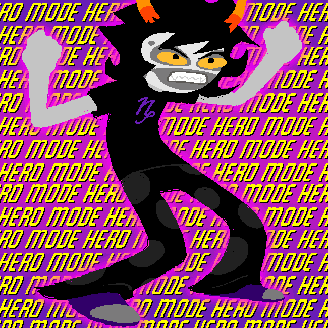
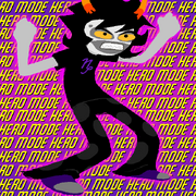
Featured Item[]
Used for the hero mode panels of Gamzee flipping the fuck out. Downloadable here.
Data Structures for Assholes Fonts[]
- Impact Bold is the font used for the "DATA STRUCTURES" part of the title and elsewhere on the book cover. Purchasable here.
- Leftovers is the second font used for the "ASSHOLES" part of the title and blurb on the cover. Downloadable here.
Paradox Space lettering[]
Sunday Comics BB is used for most, if not all the non-custom lettering in the Paradox Space comics. It is downloadable here.
Hiveswap logo[]
The font used for the Hiveswap logo is a slightly customised version of Republika Ps Cnd. In some cases, promo material for Act 2 uses the font unaltered. It is downloadable here.
Adobe Garamond Pro[]
The main font used during the epilogues. It is meant to resemble an entry on the fan fiction website Archive of Our Own.
Wet Dreamz[]
Used for Pesterquest's logo. It is downloadable here.
Custom Fonts[]
The Humans' Handwriting[]
Many of the kids handwritings have been revealed in the comic. John, Jade, Dave, Rose, and Jake all wrote messages in writing accompanying birthday gifts to each other. Dirk's handwriting can be seen in the version of Pony Pals he edited for Jane, and Roxy's in her Wizardy Herbert story. Nanna also writes John a message in Colonel Sassacre's Daunting Text.
Rose and Jake also wrote down genetic codes on their walls and into private journals.
John, Jade and Jake have also been witnessed writing on walls, to convey heartfelt messages.
The kids’ handwriting style probably wouldn't change much upon growing up, meaning Nanna's handwriting, as seen on the inside of John's jokester book, is probably the same as Jane's. Font versions of the kids' handwriting can be found here.
The Trolls' Handwriting[]
Surprisingly, the trolls' handwriting is often shown in the English alphabet instead of the Alternian one, presumably for the readers' convenience.
Vriska, Tavros, Terezi, Aradia and Gamzee all wrote down parts of the DNA code of their session’s First Guardian on their bedroom walls and into their Flarping/~ATH Manuals. Vriska's handwriting has also been seen on the drawing of her flarping character as well as on the map![]() she sent Tavros. Terezi wrote on walls with chalk to talk to her exile. Nepeta's is seen here
she sent Tavros. Terezi wrote on walls with chalk to talk to her exile. Nepeta's is seen here![]() .
.
In contrast to all of the previously mentioned cases, Mindfang's journal is written in a cerulean colored Daedric alphabet.
Carapacian handwriting[]
Most Carapacians seem to be able to read and write and we have seen the handwriting of Jack Noir and Clubs Deuce. Ms. Paint wrote a single “SORRY” under one of Andrew’s declarations of “Panel isn’t done yet!”
Sound-effect font[]
Most sound effects in Homestuck are portrayed using the same lettering. The text is handwritten by Andrew, and is therefore not presently available in a coherent font.
Consort Inscriptions[]
Temples within the planets of each player feature runes shaped like the Consorts. Each consort race uses stylised symbols of their own race, the frog temple does however feature symbols used by all races. Rose was capable of deciphering these inscriptions and Sollux did the same in order to create Sgrub.